This infographic had some interesting ideas. I thought that was something worth sharing whilst we wait out the winter months.
Insanely Easy Home and Garden Hacks: An infographic
Reply

This infographic had some interesting ideas. I thought that was something worth sharing whilst we wait out the winter months.
I found this infographic on incorporating green elements into the construction of a new home. I would like to try some of these one day into any renovations we do at the schoolhouse.
I was speaking to someone the other day who has installed solar panels at their home and how much they are enjoying it. I have to think we don’t have a giant, steep, green roof for nothing!
This infographic comes from sustainablog.

Here is some good advice from blogger The Site Box
Well the schoolhouse is anyway.
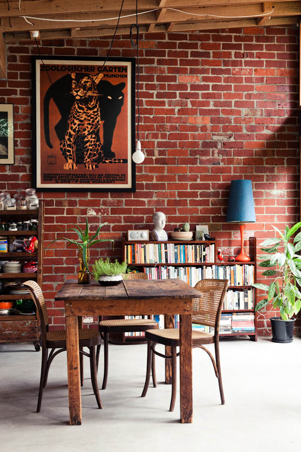
We’ve got a red brick schoolhouse but most of the brick is buried behind plaster. The two bedrooms each have a brick wall. Wonder what we could do…

Source: thedesignfiles.net via Ariel on Pinterest

Source: adoreyourplace.com via Ariel on Pinterest

Source: adoreyourplace.com via Ariel on Pinterest

Source: momspark.net via Ariel on Pinterest
At our house, my grandmother never used a watering can.
We always had a large apple juice can with holes punched in the bottom and a bucket. That’s what we used for watering and it worked like a charm. Sure it didn’t look like something Martha Stewart would approve of but hey, my grandmother wasn’t a convict either.
Here is an interesting infographic on some pretty basic household items for gardening. I especially like the plastic pop bottle.

After many years with a great distaste for olives I have done two odd things this year.

First I started eating olives. I guess I got over that part. And second, we’ve just painted the upstairs bathroom an olive sort of green. Who would have guessed?
Now you might say, “Ariel, olives come in many colours.” And then possibly mutter, “Dumbass” when you think I am not listening. obviously that is true and it’s fairly evident given the picture above. Now who is the dumbass?
We looked around and both actually agreed on Olivine by Behr.
Behr, Olivine, 420F 5 – color-swatches.com.
That’s a sort of olive-green with a bit of sage thrown in I guess. It looks good I think. It isn’t as olive as the name suggests and it looks nice with our brown tile and black-brown cabinets. Watch for impending, non-olive related photos to support my case.
OK so I made that word up.
But a vestibule is good. You can take your boots off in here and not mess up the rest of the house. It can be where the winter clothes live while you are in summer wear. It’s a great place to stand while you wait for the school bus or your ride to town.
We haven’t had a chance to paint the vestibule yet and I am itching to do it. There is some extra vacation time tucked away in my file so I may have to do it this fall. And while we are just painting now, eventually we want to make this small, square entrance way a useful space.
I’ve turned to Pinterest to see what ideas it can offer.

Source: concepteastcoast.co.uk via Ariel on Pinterest


Source: Uploaded by user via Ariel on Pinterest
Our four-year old patio furniture from Ikea has had it.
We have a little set we use on our balcony at the condo. That brown acacia stuff that we have just doesn’t weather very well. With each passing year it gets more and more decrepid looking. For awhile I kidded myself and thought it was just maturing and would turn a lovely darkened colour. It went gray and scaly. So I decided it can’t get any worse and tried my hand at painting it.

And yes for all my safey friends out there, I did wear all the appropriate personal protective equipment, except for a mask. I didn’t even make a mess except a small patch of grass I will cut next week anyway. At least the paint went downwind.

I think it went well. This test chair worked out to be very simple and I hope to get the rest done next weekend. This might inspire me to do more for the schoolhouse. I’d love to get some nice old Kawartha chairs (yes we call them Kawartha chairs ’cause we ain’t in Muskoka!) and do them up nicely. Wait and see!
We are still working on condo paint colours.
Around St. Paddy’s day I started thinking about green. It would be great but now our kitchen is blue and I think maybe we should go with blue throughout?
So I’ve been looking up samples. There are light blues that work well and can still be paired with reds or greens. But a deep blue has impact. What does everyone think? I need ideas! Please comment and throw your ideas around. Especially if you have seen our kitchen blue.

Source: clientsmanagement.com via Dalila on Pinterest

Source: apartmenttherapy.com via Ariel on Pinterest

Source: pinkwallpaper.blogspot.com via Ariel on Pinterest

Source: vtwonen.nl via Ariel on Pinterest

Source: ehomee.com via Ariel on Pinterest
Well my grand frame idea was a bust.
I went to the pile o’ frames we have stashed away in the office closet and found a gold gilded beauty. However I was squashed as soon at Pat got home as he has now taken up my idea to post up a wall of photos along the landing of the stairs in the condo. Which means this frame is spoken for.
When I mentioned my idea Pat thought it was a little too 90s “Friends” and I am beginning to agree. So for the time being until I think of something else, I picked up this tree ornament thingy at Dressers’ on Roncesvalles Avenue.

An inexpensive trinket that will ensure people can find our door until the creative gods strike me with an idea!

